Thank you!
Soon we will answer your question
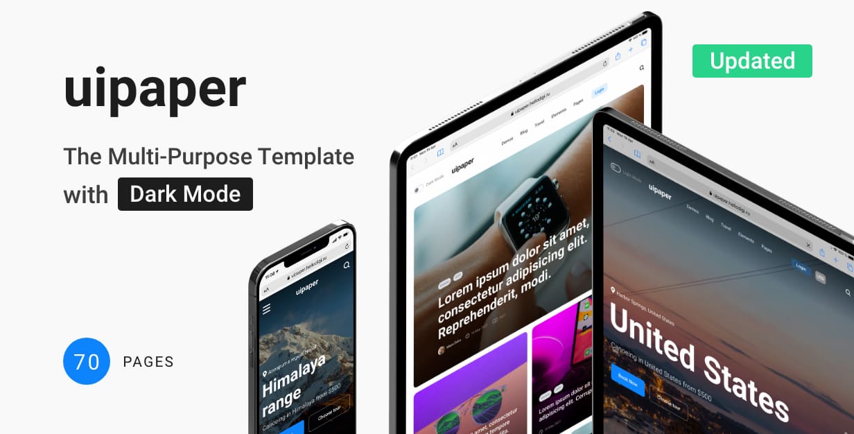
Uipaper
Getting Started
Uipaper | Documentation
Introduction
UIpaper is a great and minimalistic blog template for any purpose. Developed a lot of widgets, blocks, dark mode! The template will be constantly filled with new pages
Note: The images and videos used on the demo site are for demonstration purposes only and are not included in the download file.
Note: This is a HTML Template. Not a WordPress Theme. We will release it’s WordPress version soon.
Main Features
List Files:
Home
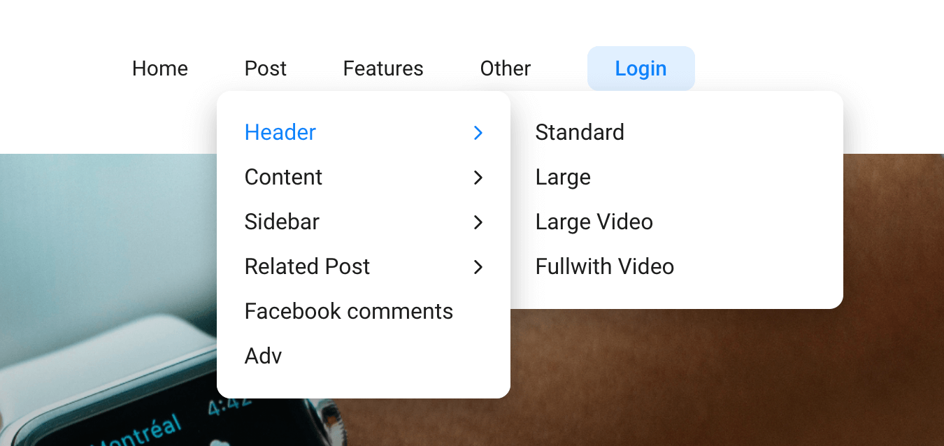
Post – Header – Header
Post – Header – Large
Post – Header – Large Video
Post – Header – Fullwith Image
Content – Accordion
Content – Gallery
Content – Video
Content – Social
Content – Content Blocks
Sidebar – Standard Right
Sidebar – Standard Left
Sidebar – Large Right
Related Post – Grid
Related Post – Slider
Related Post – List
Facebook Comments
Ads Page
Features – Author Page
Features – All Author
Category – Fullwidth
Category – Right Sidebar
Category – Left Sidebar
Category – Grid
Category – Grid Right Sidebar
Category – Grid Left Sidebar
Category – Two Columns
Category – Two Columns Right Sidebar
Category – Two Columns Left Sidebar
Category – Three Columns
Category – Sticky Post
Form – Contact Form
Form – Subscribe Form
Other – Search Results
Other – Search Results (no result)
Other – 404 Page
Other – Modals
Profile – Setting
Profile – Favorites
Profile – Favorites
Dark mode
HTML5 and CSS 3
Clean, Creative, Modern & Beautiful Design
LESS
Fully Responsive, Compatible with all screen sizes
Well Organized Files
Well Commented Code
Easy Customization
Major Browsers compatibility
Well Documented
Google Fonts Used
W3C Valid Markup
Integrated Custom Image Slider
24/7 Friendly & Quick Support
And Much More
Required Software
Text Editor
To modify this product you will require a text editor. There are a wide range of softwares out there that will do the trick but we would recommend Sumblime Text or Brackets.
Installation
Follow the steps below to setup your site template:
1. Unzip the downloaded package and open the /HTML folder to find all the template files. You will need to upload these files to your hosting web server using FTP in order to use it on your website.
FTP Client
To publish your website you will need an FTP client which is a software that will allow you to connect to and upload the HTML files to your server. We would recommend using something like FileZilla.
Connect Using FTP
In order to connect to your server using an FTP client you’ll need the following information:
- Host URL
- Username
- Password
Most hosts create an FTP account for you and commonly send out the above details in the welcome email when you sign up for a hosting plan. Others, require you to create an FTP account through your cPanel. If you have never set up an FTP account before, your host should be able to do this for you and answer any questions you may have.
Connecting using FTP
Below is an example of the FileZilla interface:
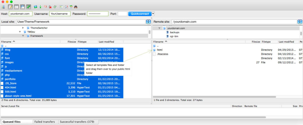
2. Below is the folder structure and needs to be uploaded to your website root directory:
- HTML/css. – Stylesheet files
- HTML/img. – Image files
- HTML/js. – Javacript files
3. You should upload all or specific HTML files as per your need.
4. You’re now good to go..! Start adding your content/images and generate your beautiful brand new website for your awesome users.
Edit Pages
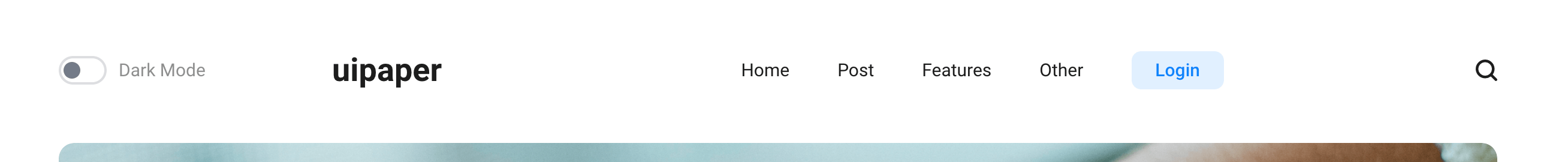
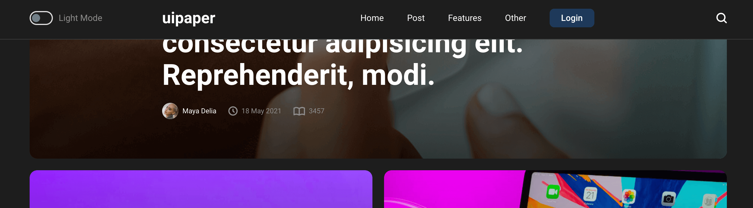
Dark/Light version
If you wish to use dark version as default you should add classes dark and dark-loaded for body, and add attribute checked for input#mode-checkbox:
<!DOCTYPE html>
<html lang="en">
<head>
    ...
</head>
<body class="dark dark-loaded transition-none">
    ...
    <div class="top-panel" id="js-panel">
       <div class="wrap">
           <div class="wrap_float">
               <div class="mode-check">
                   <input type="checkbox" id="mode-checkbox" class="mode-checkbox-input" checked>
                   <label for="mode-checkbox" class="mode-checkbox-label"
                   data-dark-title="Dark Mode"
                   data-light-title="Light Mode"></label>
               </div>
               <div class="wrap-center">
                   ...
               </div>
               <div class="search-button" id="btn-search"></div>
           </div>
           ...
       </div>
    </div>
    ...
</body>
</html>
if you don’t need to use mode switching, you should remove div.mode-check:
<!DOCTYPE html>
<html lang="en">
<head>
    ...
</head>
<body class="dark dark-loaded transition-none">
    ...
    <div class="top-panel" id="js-panel">
       <div class="wrap">
           <div class="wrap_float">
               <div class="mode-check">
                   <input type="checkbox" id="mode-checkbox" class="mode-checkbox-input" checked>
                   <label for="mode-checkbox" class="mode-checkbox-label"
                   data-dark-title="Dark Mode"
                   data-light-title="Light Mode"></label>
               </div>
               <div class="wrap-center">
                   ...
               </div>
               <div class="search-button" id="btn-search"></div>
           </div>
           ...
       </div>
    </div>
    ...
</body>
</html>
Top panel
You can do the top panel fixed or fixed scrolling up. To do this you have to add class fixed or add class fixed-scroll-up to .top-panel
<div class="top-panel fixed" id="js-panel">
    <div class="wrap">
        ...
    </div>
</div>
Examples:
Fixed Panel
Fixing top panel when scrolling up
Logo
The logo is written in text and looks like:
<!DOCTYPE html>
<html lang="en">
<head>
    ...
</head>
<body class="transition-none">
    ...
    <div class="top-panel" id="js-panel">
       <div class="wrap">
           <div class="wrap_float">
               ...
               <div class="wrap-center">
                   <a href="/" class="logo">
                       uipaper
                   </a>
               </div>
               ...
           </div>
           ...
       </div>
    </div>
    ...
</body>
</html>
Favicons
Favicons are located in the folder img/favicons and connected in a <head>:
<link rel="apple-touch-icon" sizes="180x180" href="img/favicons/apple-touch-icon.png">
<link rel="icon" type="image/png" sizes="32x32" href="img/favicons/favicon-32x32.png">
<link rel="icon" type="image/png" sizes="16x16" href="img/favicons/favicon-16x16.png">
<link rel="icon" type="image/png" sizes="16x16" href="img/favicons/android-chrome-192x192.png">
<link rel="icon" type="image/png" sizes="16x16" href="img/favicons/android-chrome-512x512.png">
<link rel="icon" type="image/png" href="img/favicons/favicon-32x32.png" sizes="32x32">
<link rel="icon" type="image/png" sizes="16x16" href="img/favicons/favicon.ico">
Menu
The menu supports a high level of nesting. The menu structure should strictly look like: ul> li> ul> li (without unnecessary divs and other elements).
<!DOCTYPE html>
<html lang="en">
<head>
    ...
</head>
<body class="transition-none">
    ...
    <div class="top-panel" id="js-panel">
       <div class="wrap">
           <div class="wrap_float">
               ...
               <div class="wrap-center">
                   ...
                   <div class="menu" id="js-menu">
                       <ul>
                           <li><a href="#">Home</a></li>
                           <li>
                               <a href="#">Level 1</a>
                               <ul>
                                   <li>
                                       <a href="#">Level 2</a>
                                       <ul>
                                           <li><a href="#">Level 3</a></li>
                                           <li><a href="#">Level 3</a></li>
                                       </ul>
                                   </li>
                                   <li><a href="#">Level 2</a></li>
                                   <li><a href="#">Level 2</a></li>
                               </ul>
                           </li>
                           <li><a href="#">Level 1</a></li>
                           <li><a href="#">Level 1</a></li>
                       </ul>
                   </div>
               </div>
               ...
           </div>
           ...
       </div>
    </div>
    ...
</body>
</html>
Styles of Top Panel are in the top-panel.css file.
Posts Blocks
Posts can be displayed in the following options: grid, one column, two columns, three columns. To set the desired option, you need to add the corresponding class for the div.post-items-list. Classes: posts-grid, posts-fullwidth, posts-two-columns, posts-three-columns.
<div class="post-items-list posts-grid">
    <a href="single.html" class="post-item">
        ...
    </a>
    <a href="single.html" class="post-item">
        ...
    </a>
    <a href="single.html" class="post-item">
        ...
    </a>
    <a href="single.html" class="post-item">
        ...
    </a>
</div>
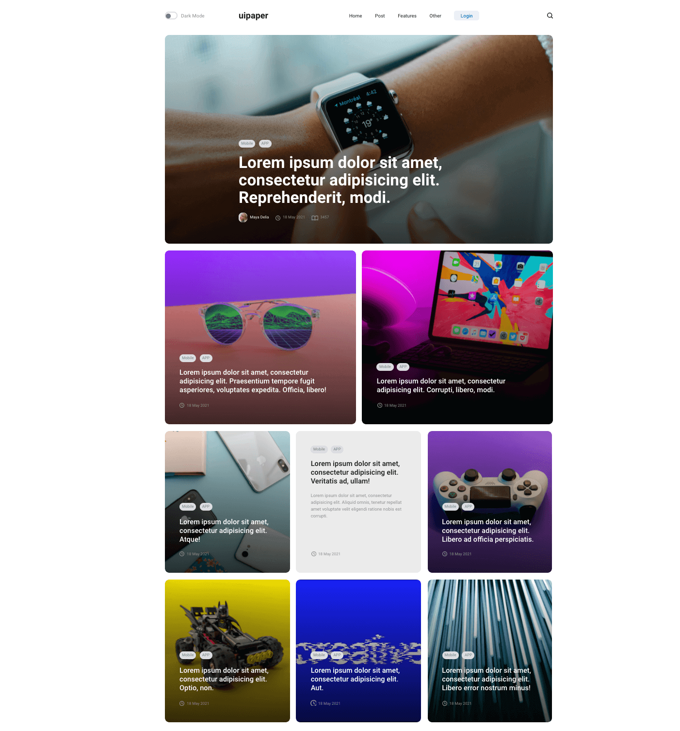
Examples:
http://uipaper.hellodigi.ru/archive-fullwidth.html
http://uipaper.hellodigi.ru/archive-grid.html
http://uipaper.hellodigi.ru/archive-two-columns.html
http://uipaper.hellodigi.ru/archive-three-columns.html
if the post does not have a background image, then the class without-bg is applied to it:
        <a href="single.html" class="post-item without-bg">
          ...
        </a>
Show more button
When the “show more” button is pressed, the animation is triggered. To do this, during processing, you need to show the div.loader, and hide the .show-more-btn:
<div class="show-more">
   <div class="show-more-btn">
       <span>Show more</span>
   </div>
   <div class="loader">
       <svg class="circular" viewBox="25 25 50 50">
          <circle class="path" cx="50" cy="50" r="20" fill="none" stroke-width="2" stroke-miterlimit="10"/>
        </svg>
   </div>
</div>
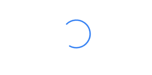
These actions are written in the scripts.js file at the end of the document.
social networks links

For social networks links you need to use svg icons and connect them via the <img> tag with the class img-svg:
<div class="socials">
   <a class="soc-link">
       <img src="img/facebook-icon.svg" class="img-svg" alt="">
   </a>
   <a class="soc-link">
       <img src="img/twitter-soc-icon.svg" class="img-svg" alt="">
   </a>
   <a class="soc-link">
       <img src="img/behance-icon.svg" class="img-svg" alt="">
   </a>
</div>
All links must be children elements of the div.socials.
The size of the icon is specified in the styles, in the file socials.css.
Instagram section
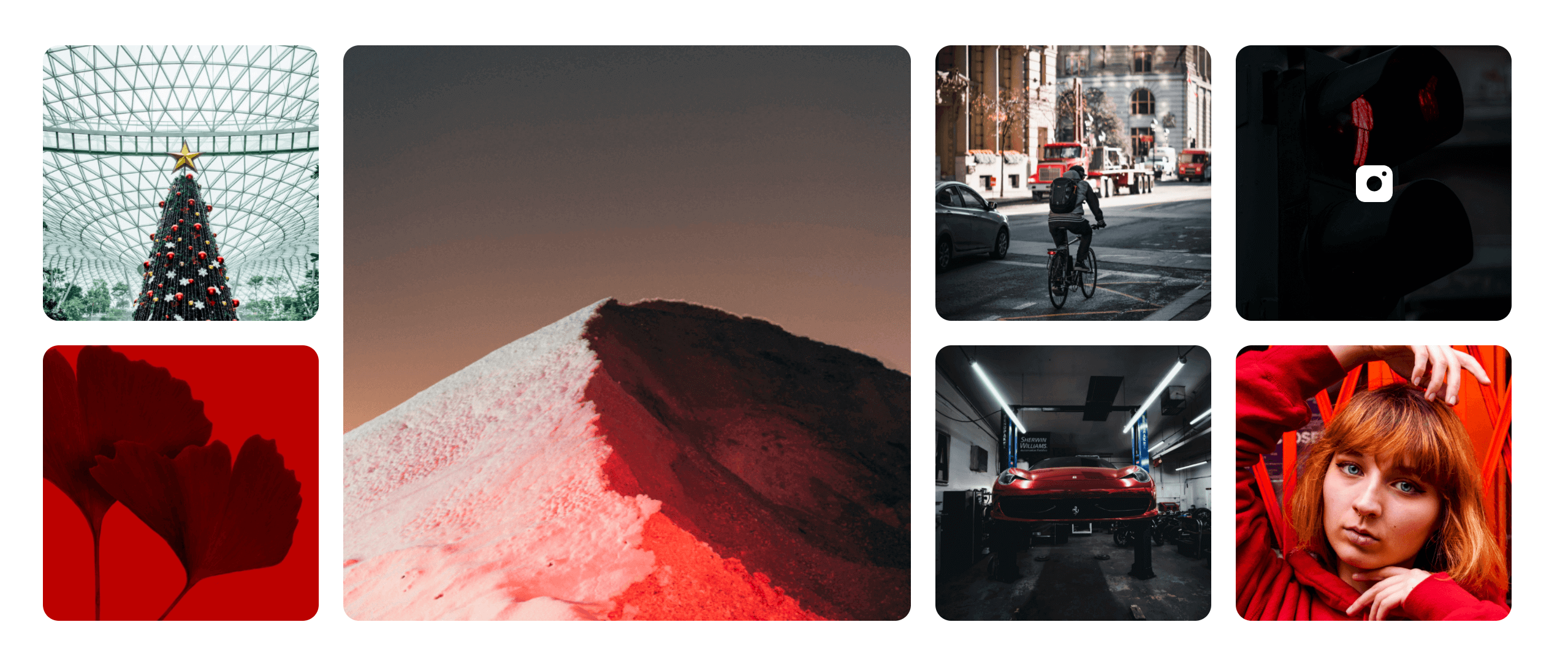
This block displays only 7 records. If you want to change, you can edit the instagram-section.css file.
<div class="instagram-section section">
   <div class="wrap">
       <div class="wrap_float instagram-posts-list" id="instagram-posts">
           <div class="instagram-post-item">
               <img src="img/inst-1.jpg" alt="">
           </div>
           <div class="instagram-post-item">
               <img src="img/inst-2.jpg" alt="">
           </div>
           <div class="instagram-post-item">
               <img src="img/inst-3.jpg" alt="">
           </div>
           <div class="instagram-post-item">
               <img src="img/inst-4.jpg" alt="">
           </div>
           <div class="instagram-post-item">
               <img src="img/inst-5.jpg" alt="">
           </div>
           <div class="instagram-post-item">
               <img src="img/inst-6.jpg" alt="">
           </div>
           <div class="instagram-post-item">
               <img src="img/inst-7.jpg" alt="">
           </div>
       </div>
   </div>
</div>
Sticky “Share” block
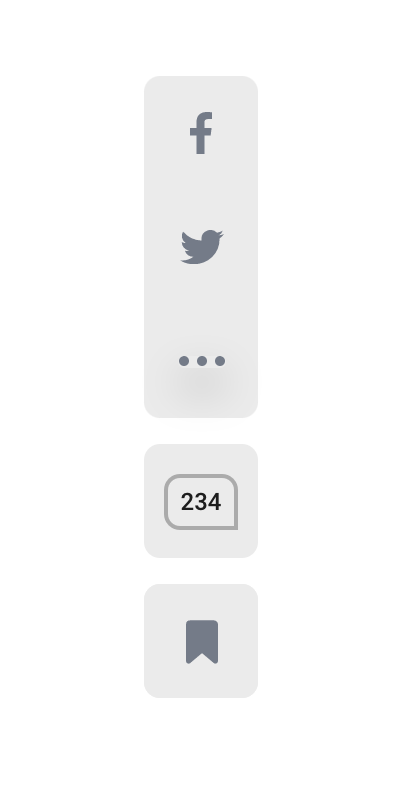
The share block must have a structure just like in the layout, and is located in the div.stycky-parent.
<div class="page-wrap">
    <div class="page-wrap-content">
        <div class="breadcrumbs">
            ...
        </div>
        <div class="post-single-wrap sticky-parent">
            <div class="share-block">
                <div class="share-block-main js-share-block-main">
                    <div class="socials">
                        <a class="soc-link" data-title="Facebook">
                            ...
                        </a>
                        <a class="soc-link" data-title="Twitter">
                            ...
                        </a>
                        <div class="soc-link show-more-socials" style="display: none;"></div>
                    </div>
                    <div class="share-block-item js-anchor link-to-comments" data-href="#comments-section">
                        <div class="comments-count">
                            <span>234</span>
                        </div>
                    </div>
                </div>
                <div class="share-block-item mobile-item js-mobile-share-show mobile-share-show-btn">
                    <div class="show-mobile-icon"></div>
                </div>
                <div class="share-block-item add-to-favourites">
                    <div class="favourites-tag js-add-to-fav">
                        <i class="is-added bouncy"></i>
                        <i class="not-added bouncy"></i>
                        <span class="fav-overlay"></span>
                    </div>
                </div>
            </div>
            ...
        </div>
        ...
    </div>
</div>
The link to comments is disabled automatically if there is no block with comments.
If you don’t need to use this block, just remove the div.share-block.
Styles for this block are edited in the share.css file.
Single Header
Header can be in several versions:
standard, with video link, background video.
The link to the full-screen video is in the data-video attribute.
This link should have the class js-open-fullscreen-video:
<div class="open-video-link js-open-fullscreen-video" data-video="video/long.mp4">
   <span>Watch the video</span>
</div>
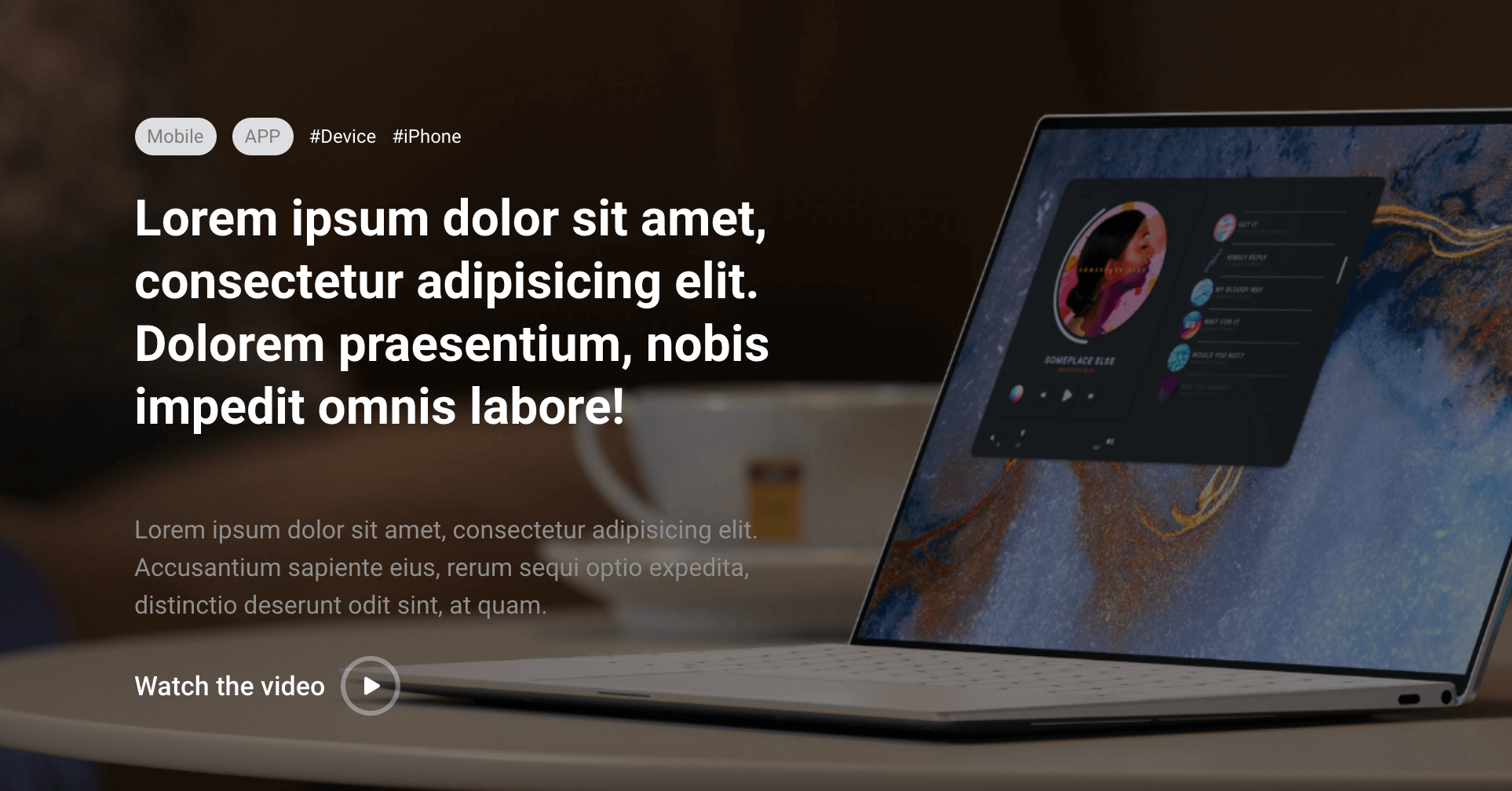
The background video is in the video-bg block.
<div class="single-header header-wide header_video">
    <div class="wrap wrap-center">
        <div class="wrap_float">
            <div class="breadcrumbs">
                ...
            </div>
            <h1 class="page-title">
               ...
           </h1>
        </div>
    </div>
    <div class="video-bg js-video-bg bg-img image-cover" data-video="video/video.mp4"></div>
</div>
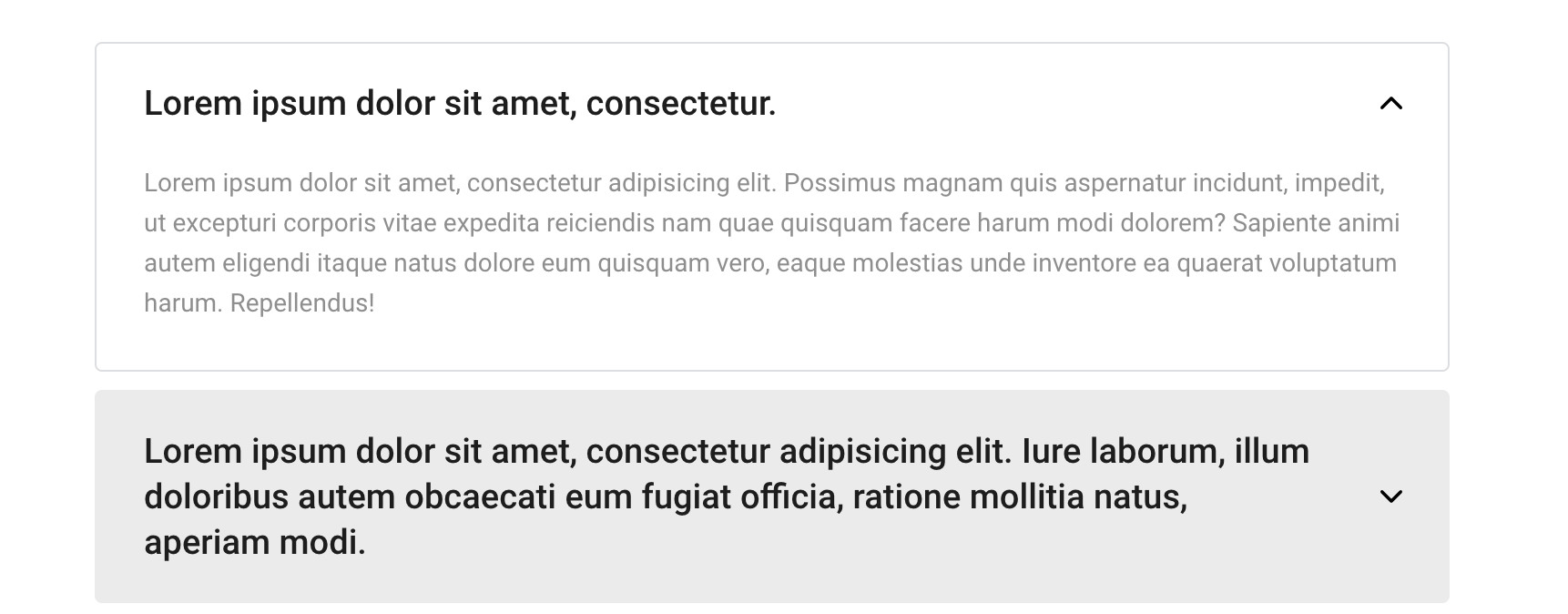
Accordion
The accordion is added by the layout of the accordion-block. For the second accordion, add the with-border class:
<div class="accordion-block with-border">
    <div class="accordion-item">
        <div class="accordion-item-title">
            <span>
                ...
            </span>
        </div>
        <div class="accordion-item-content">
            <p>
                ...
            </p>
        </div>
    </div>
    <div class="accordion-item">
        <div class="accordion-item-title">
            <span>
                ...
            </span>
        </div>
        <div class="accordion-item-content">
            <p>
                ...
            </p>
        </div>
    </div>
</div>
Gallery
The gallery consists of columns of images and can be 2, 3, 4 columns + the same in a wide version.
Each version is added by the layout of the div.block-columns.gallery-columns, with the addition of the columns-2, columns-3, columns-4 classes, and the wide-columns class if you need to include a wide option. To be able to open the image at full size, the lightgallery-on class must be added.
See gallery.html page for details.
<div class="block-columns gallery-columns columns-2 wide-columns lightgallery-on">
    <div class="block-column">
        <figure class="block-caption img-caption">
            ...
        </figure>
    </div>
    <div class="block-column">
        <figure class="block-caption img-caption">
            ...
        </figure>
    </div>
    <div class="block-column">
        <figure class="block-caption img-caption">
            ...
        </figure>
    </div>
    <div class="block-column">
        ...
    </div>
</div>
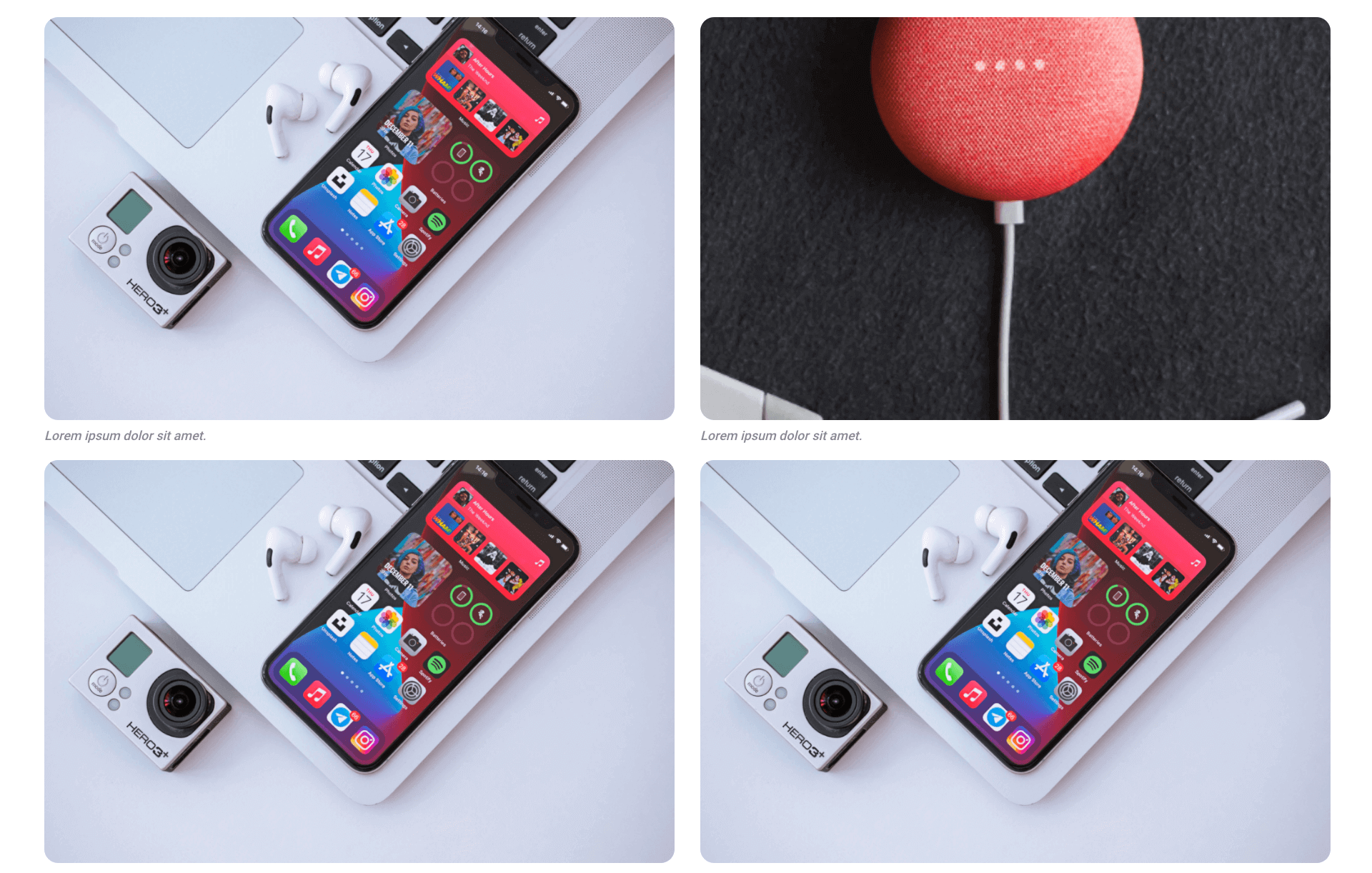
If you are using a lightgallery, then the block must contain an element button.zoom-btn
<button class="zoom-btn"></button>
Sliders
There are three types of sliders on the post page: standard, wide, and fullwidth.
For a wide slider, use the wide wide-slider classes.
For fullwidth, use the superwide superwide-slider classes:
<div class="slider-block wide wide-slider">
    <div class="slider-block-items slider">
        <div class="slider-block-item">
            ...
        </div>
        <div class="slider-block-item">
            ...
        </div>
        <div class="slider-block-item">
            ...
        </div>
    </div>
    <div class="count"><span class="current-val">1</span> of <span class="total-val"></span></div>
</div>
The number of slides in the counter is filled in automatically.
Slider styles are located in the sliders.css file
Video
Video can be used in the following options: standard, wide, fullwidth, two columns.
To insert a video, you need to get an iframe from YouTube, vimeo, or upload your file.
<div class="block-columns video-columns wide-columns columns-2">
    <div class="block-column">
        <div class="video-wrap">
            ... iframe here ...
        </div>
    </div>
    <div class="block-column">
        <div class="video-wrap">
            ... iframe here ...
        </div>
    </div>
    <div class="block-column">
        <div class="video-wrap">
            ... iframe here ...
        </div>
    </div>
</div>
Social networks Posts
Social media posts are inserted via an iframe.
The iframe needs to be received on social network page (“share” function).
Example: socials.html
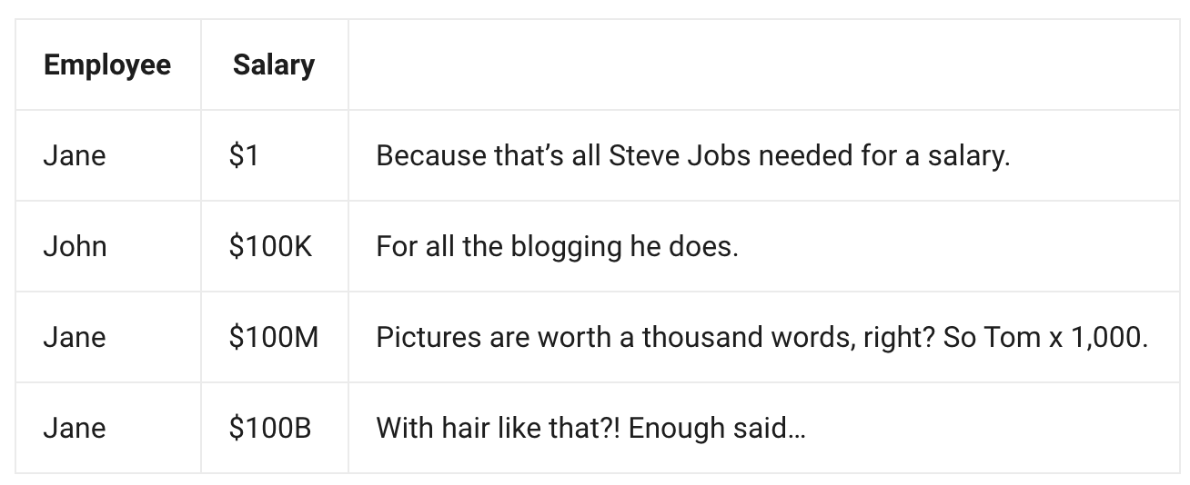
Tables
The table should have a strict form:
<table>
    <tbody>
        <tr>
            <th>...</th>
            <th>...</th>
        </tr>
        <tr>
            <td>...</td>
            <td>...</td>
        </tr>
        <tr>
            <td>...</td>
            <td>...</td>
        </tr>
    </tbody>
</table>
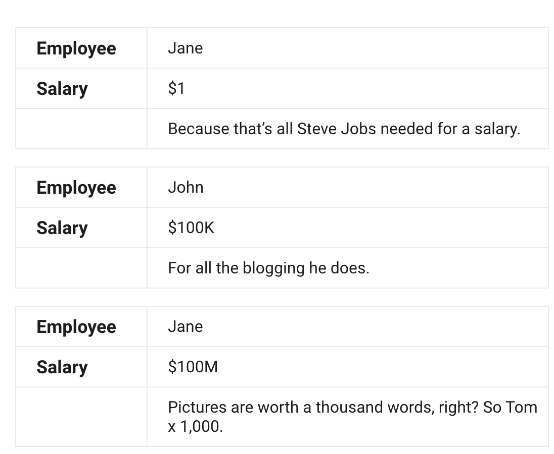
Also, the table can be without a header.
<table>
    <tbody>
        <tr>
            <td>...</td>
            <td>...</td>
        </tr>
        <tr>
            <td>...</td>
            <td>...</td>
        </tr>
    </tbody>
</table>
If this view is used, the table will have a convenient view in the mobile version.
Examples on the content-blocks page.
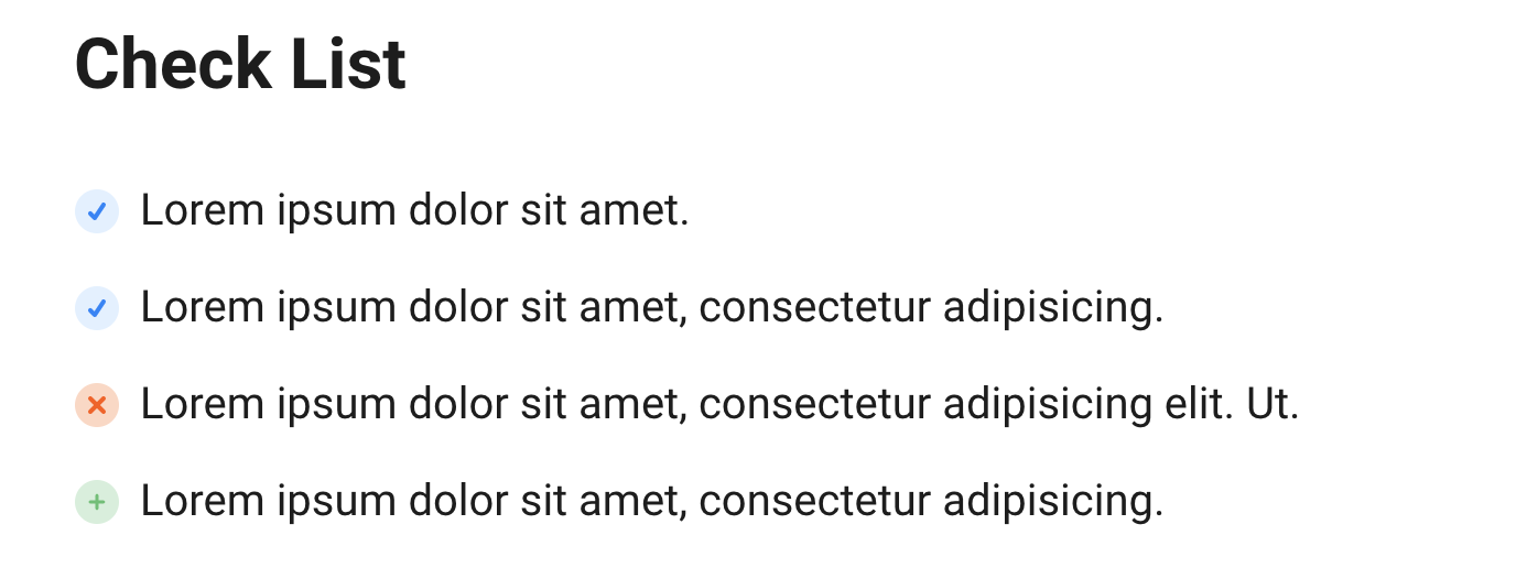
Lists (ol, ul)
Lists can be of three options: marked, numbered, check List.
Marked and numbered are used without classes as ul and ol.
For check List you should use next construction:
<ul class="checklist-ul">
    <li>
        ...
    </li>
    <li>
        ...
    </li>
    <li class="disable-li">
        ...
    </li>
    <li class="plus-li">
        ...
    </li>
</ul>
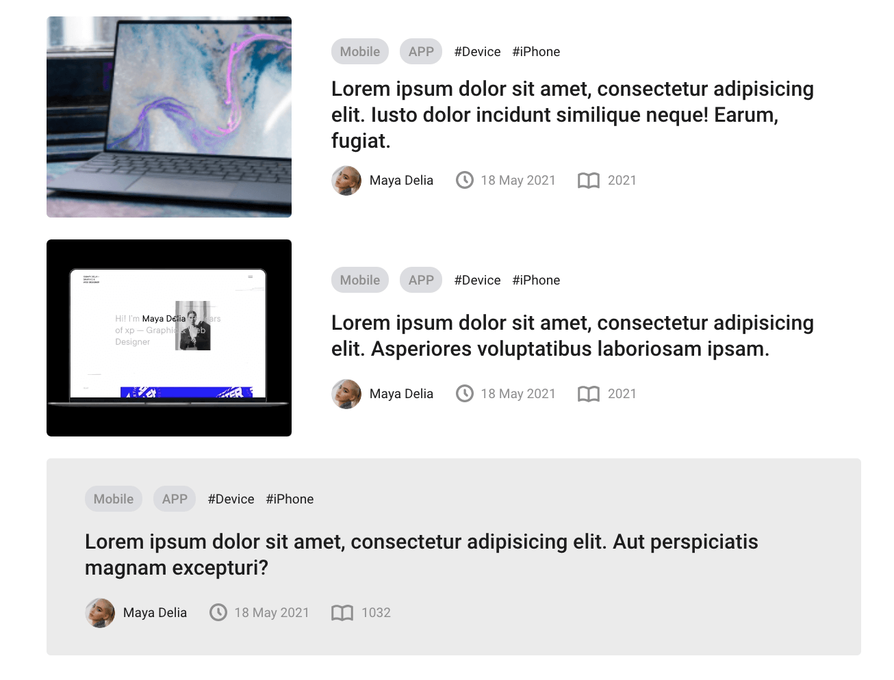
Related Posts
Related posts can be displayed with a slider, list, or grid.
When using the list option, if there is no image, use the without-img class.
In the variant with a grid, only three posts are displayed.
<div class="posts-list-section section">
<div class="wrap wrap-center">
<div class="wrap_float">
<h2 class="title">
Related Posts
</h2>
<div class="section-content">
<div class="post-list">
<div class="post-preview-item">
<div class="post-preview-item-cover">
<img src="..." alt="">
</div>
...
</div>
<div class="post-preview-item">
<div class="post-preview-item-cover">
<img src="..." alt="">
</div>
...
</div>
<div class="post-preview-item without-img">
...
</div>
</div>
</div>
</div>
</div>
</div>
Favorites
To mark a post as favorite, add the favorites-tag.
If post marked as favorite, this tag should be with class added.
<div class="favorites-tag added js-add-to-fav">
<i class="is-added bouncy"></i>
<i class="not-added bouncy"></i>
<span class="fav-overlay"></span>
</div>
Animation set on js-add-to-fav class and described in scripts.js file.
Sidebar
When using a sitebar on the page, the with-sidebar class for page-wrap or higher must be present. When using a sitebar on the left, add the left-sidebar class. If right – right sidebar (default).
The presence of a sitebar is determined by the page-wrap-sidebar block.
<div class="page-wrap with-sidebar left-sidebar">
<div class="page-wrap-content">
...
</div>
<div class="page-wrap-sidebar">
<div class="sidebar">
...
</div>
</div>
</div>
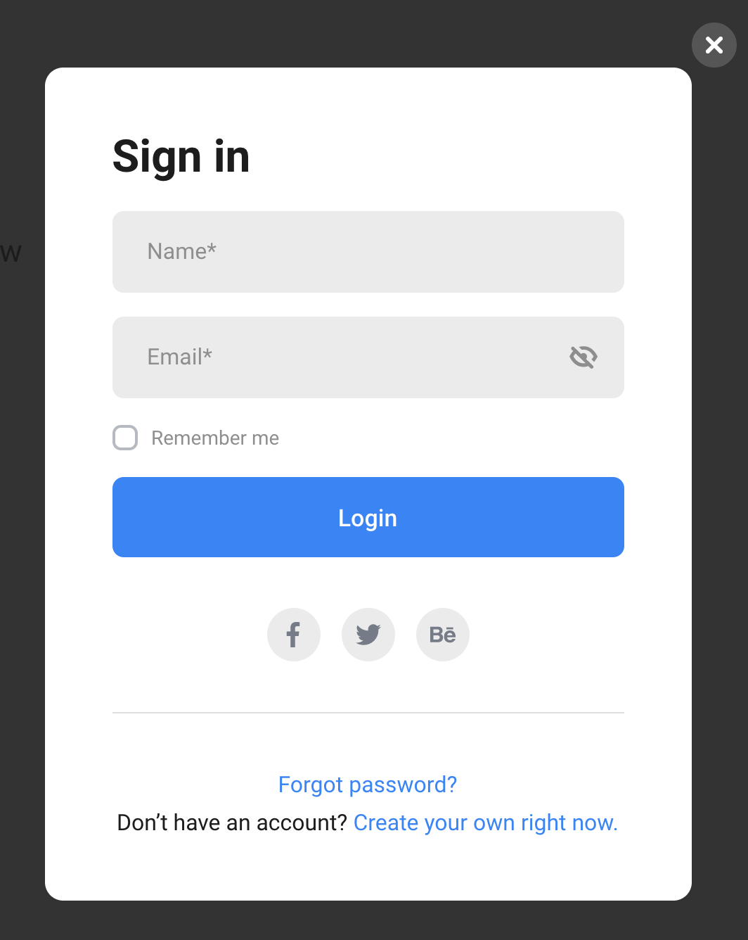
Modal windows
The modal window is connected to a button, which must have a getModal class and a data-href attribute, which specifies the id of the modal window to be called.
<button class="btn getModal" data-href="#modal-login">Login</button>
layout of modal windows is at the bottom of the document
<div style="display: none;">
<div class="modal modal_default modal_login" id="modal-login">
<div class="modal_wrap">
<h2 class="title">Sign in</h2>
<div class="modal-form">
...
</div>
...
</div>
<div class="modal_close"></div>
</div>
</div>
Tours slider
if you need to use a page without top padding you should use class no-padding for body.
<section class="slider-section js-fix-height" id="js-slider-section">
<div class="slide">
...
</div>
<div class="slide">
...
</div>
<div class="slide">
...
</div>
<div class="slide">
...
</div>
</section>
To add new slide you have to add new div.slide.
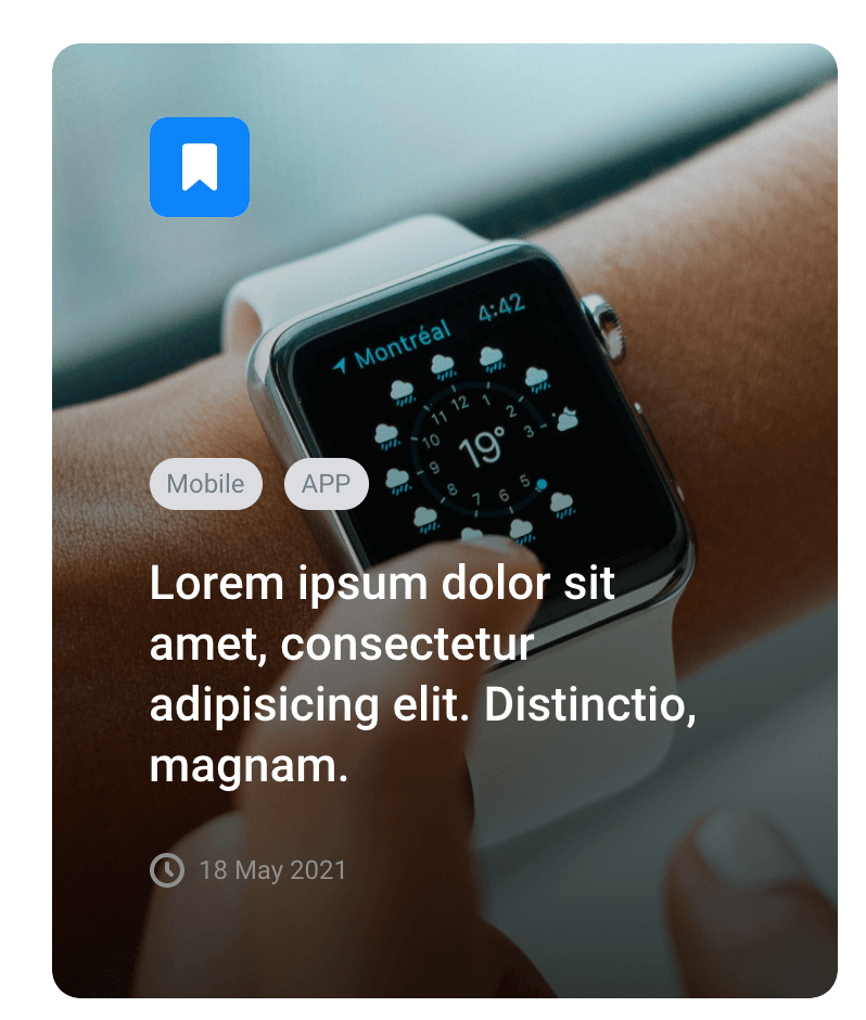
Tour and hotel post (with shadow)
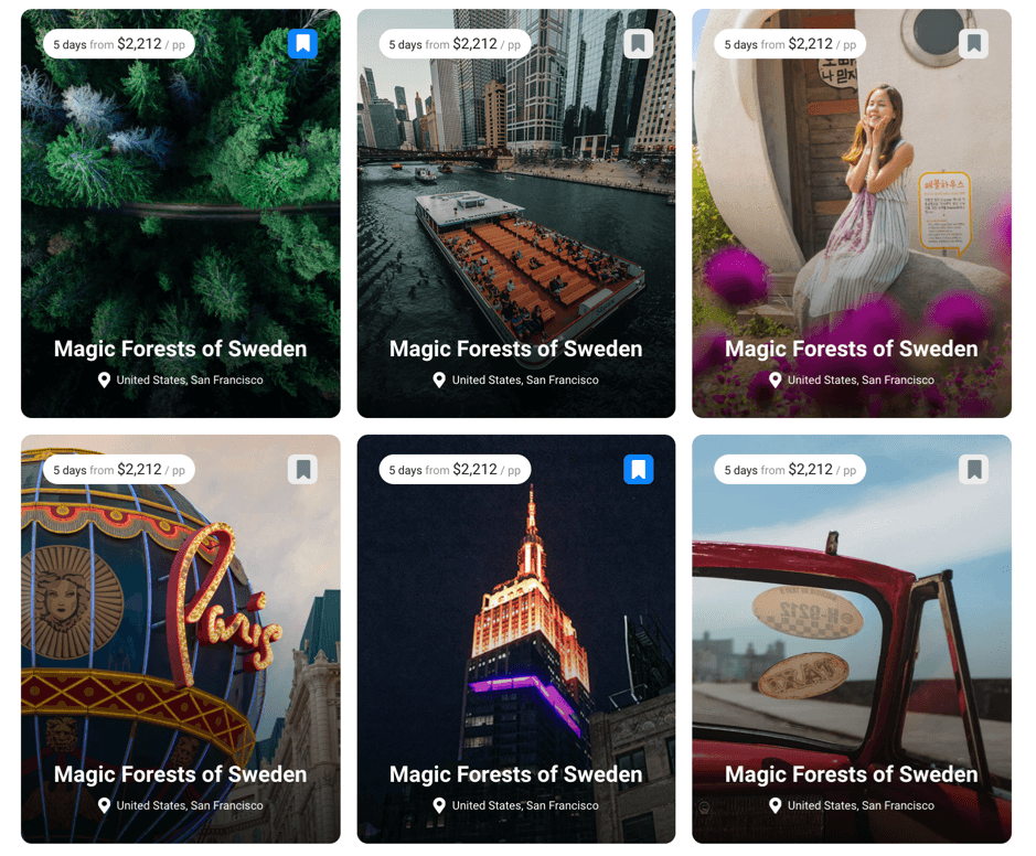
All these posts have structure:
<a href="tour-page-sidebar-right.html" class="packages-item">
<div class="shadow js-shadow"></div>
<div class="bg-img" style="background-image: url(img/tour-1.jpg)"></div>
<div class="packages-item-head">
<div class="packages-cost">...</div>
<div class="favorites-tag added js-add-to-fav">
...
</div>
</div>
<div class="packages-item-foot">
<h3 class="packages-title">...</h3>
<div class="location">...</div>
</div>
</a>
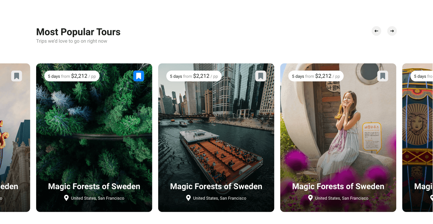
Most popular Tours
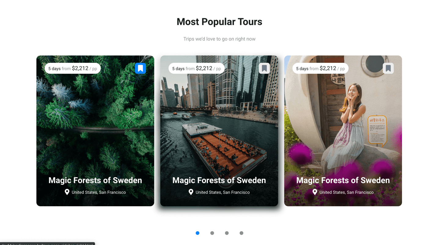
For this slider you have to use structure:
<div class="packages-slider">
<a href="tour-page-sidebar-right.html" class="packages-item">
...
</a>
<a href="tour-page-sidebar-right.html" class="packages-item">
...
</a>
<a href="tour-page-sidebar-right.html" class="packages-item">
...
</a>
<a href="tour-page-sidebar-right.html" class="packages-item">
...
</a>
</div>
To use this slider fullwidth you have to add fullwidth class for slider
<div class="packages-slider fullwidth">
<a href="tour-page-sidebar-right.html" class="packages-item">
...
</a>
<a href="tour-page-sidebar-right.html" class="packages-item">
...
</a>
<a href="tour-page-sidebar-right.html" class="packages-item">
...
</a>
<a href="tour-page-sidebar-right.html" class="packages-item">
...
</a>
</div>
Destinations
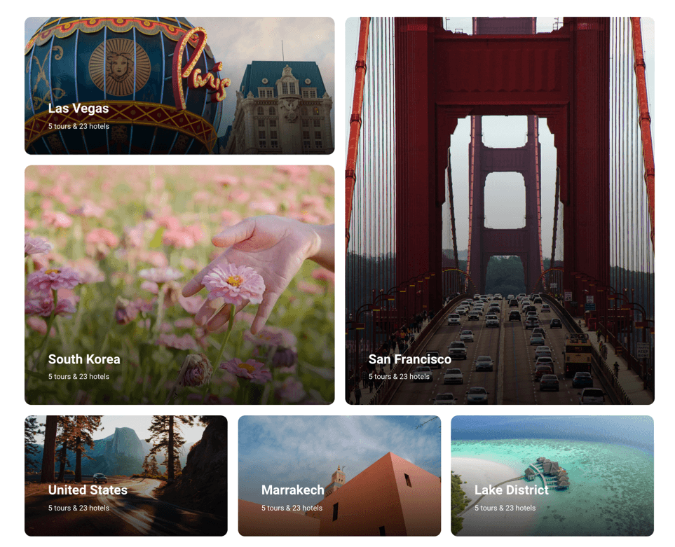
Destination posts have structure:
<div class="collection-list grid">
<a href="tour-list-fullwidth.html" class="collection-list-item">
<img src="img/tour-2.jpg" alt="" class="image-cover bg-img">
<div class="collection-list-item-wrap">
<h3 class="collection-title">...</h3>
<div class="collection-subtitle">...</div>
</div>
</a>
<a href="tour-list-fullwidth.html" class="collection-list-item">
<img src="img/article-2.jpg" alt="" class="image-cover bg-img">
<div class="collection-list-item-wrap">
<h3 class="collection-title">...</h3>
<div class="collection-subtitle">...</div>
</div>
</a>
<a href="tour-list-fullwidth.html" class="collection-list-item">
<div class="video-bg js-video-bg bg-img image-cover" data-video="video/video-2.mp4"></div>
<div class="collection-list-item-wrap">
<h3 class="collection-title">...</h3>
<div class="collection-subtitle">...</div>
</div>
</a>
</div>
To use these posts in slider you have to use structure
<div class="collection-list collection-slider">
<a href="tour-list-fullwidth.html" class="collection-list-item">
<img src="img/tour-2.jpg" alt="" class="image-cover bg-img">
<div class="collection-list-item-wrap">
<h3 class="collection-title">...</h3>
<div class="collection-subtitle">...</div>
</div>
</a>
<a href="tour-list-fullwidth.html" class="collection-list-item">
<img src="img/article-2.jpg" alt="" class="image-cover bg-img">
<div class="collection-list-item-wrap">
<h3 class="collection-title">...</h3>
<div class="collection-subtitle">...</div>
</div>
</a>
<a href="tour-list-fullwidth.html" class="collection-list-item">
<div class="video-bg js-video-bg bg-img image-cover" data-video="video/video-2.mp4"></div>
<div class="collection-list-item-wrap">
<h3 class="collection-title">...</h3>
<div class="collection-subtitle">...</div>
</div>
</a>
</div>
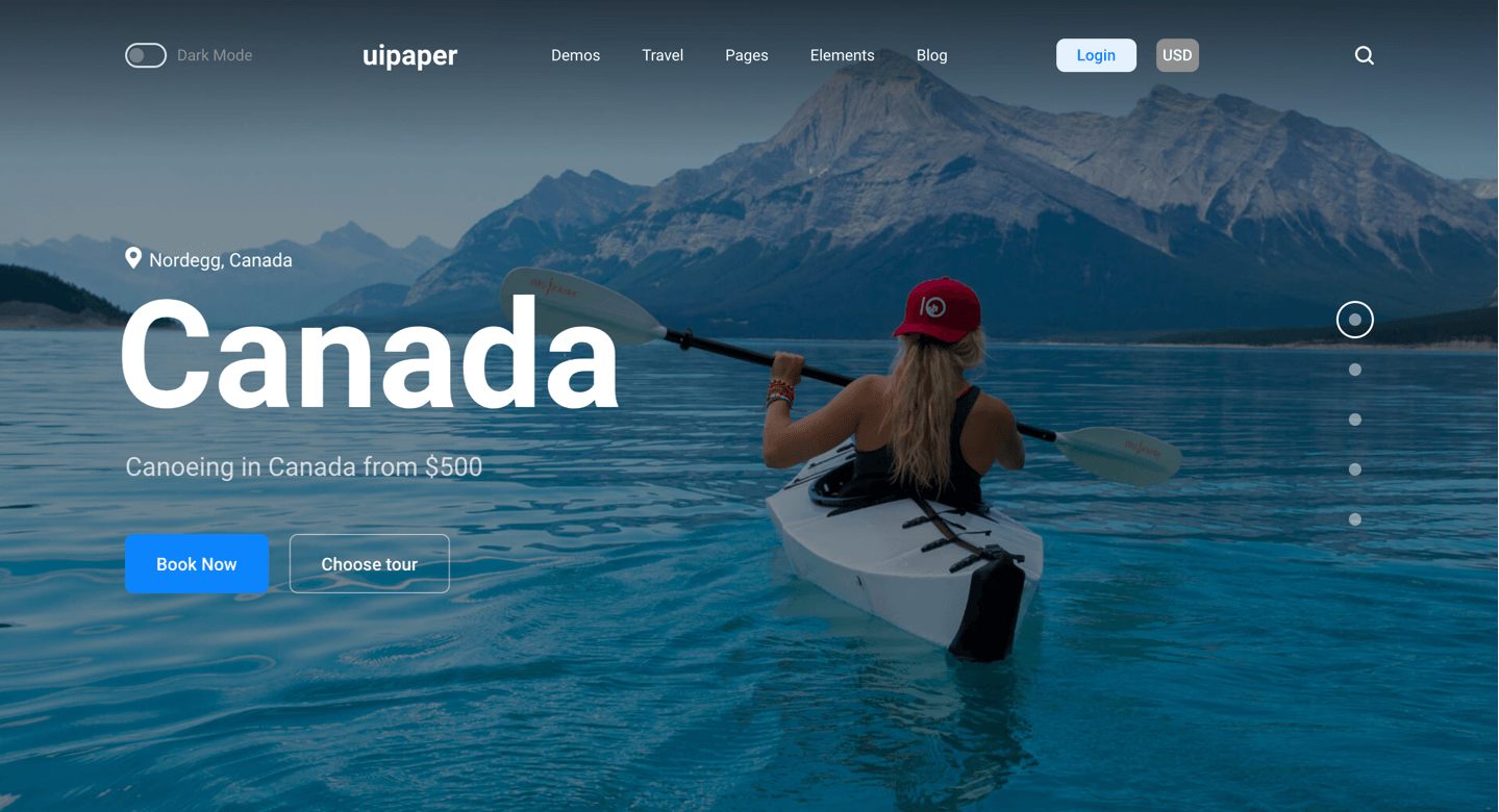
Header with search
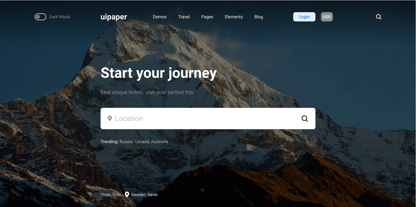
This section has structure
<section class="header-with-search">
<img src="img/travel-2.jpg" alt="" class="image-cover bg-img">
<div class="wrap wrap-center">
<div class="wrap_float">
<h1 class="page-title">...</h1>
<p class="subtitle">F...</p>
<div class="field">
<div class="destination-field">
<button class="search-submit"></button>
<input class="js-input search-input" list="destination-list" placeholder="Location">
<datalist id="destination-list">
<option value="Canada">Canada</option>
<option value="Spain">Spain</option>
</datalist>
<div class="text">
...
</div>
</div>
</div>
</div>
</div>
</section>
FAQ Section
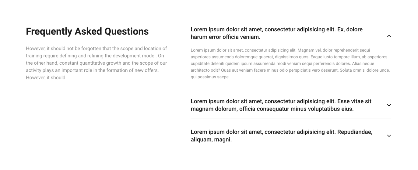
This section has structure
<section class="faq-section section">
<div class="wrap">
<div class="wrap_float">
<div class="section-left">
<h2 class="title">...</h2>
<div class="subtitle">
...
</div>
</div>
<div class="section-right">
<div class="accordion-block with-border">
<div class="accordion-item">
<div class="accordion-item-title">
<span>
...
</span>
</div>
<div class="accordion-item-content">
<p>
...
</p>
</div>
</div>
<div class="accordion-item">
<div class="accordion-item-title">
<span>
...
</span>
</div>
<div class="accordion-item-content">
<p>
...
</p>
</div>
</div>
<div class="accordion-item">
<div class="accordion-item-title">
<span>
...
</span>
</div>
<div class="accordion-item-content">
<p>
...
</p>
</div>
</div>
</div>
</div>
</div>
</div>
</section>
To add new item you have to add new div.accordion-item
Filters

Filters block has structure:
<div class="filter-overlay"></div>
<div class="filter-panel">
<div class="filter-item">
...
</div>
<div class="filter-item">
...
</div>
<div class="filter-item">
...
</div>
<div class="filter-item">
...
</div>
</div>
Filter with checkboxes (several variants):
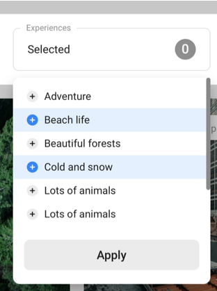
<div class="filter-item-options">
<div class="options-list checkbox-list">
<input type="checkbox" id="exp-1" name="experiences-input">
<label for="exp-1">Adventure</label>
<input type="checkbox" id="exp-2" name="experiences-input">
<label for="exp-2">Beach life</label>
...
</div>
<div class="filter-btn-wrap">
<div class="filter-btn apply-btn">Apply</div>
</div>
</div>
Filter with radio buttons (only one variant):
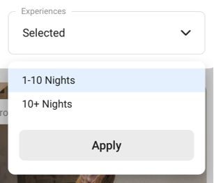
<div class="filter-item">
<div class="filter-item-field">
<div class="label">...</div>
<div class="filter-item-value">
<span class="selected-text">...</span>
<div class="filter-arrow"></div>
</div>
</div>
<div class="filter-item-options">
<div class="options-list radio-list">
<input type="radio" id="duration-1" name="duration-input" value="1-10 Nights">
<label for="duration-1">1-10 Nights</label>
<input type="radio" id="duration-2" name="duration-input" value="10+ Nights">
<label for="duration-2">10+ Nights</label>
</div>
<div class="filter-btn-wrap">
<div class="filter-btn apply-btn">Apply</div>
</div>
</div>
</div>
Filter with months list:
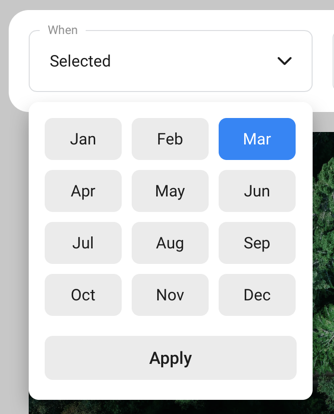
<div class="filter-item">
<div class="filter-item-field">
<div class="label">When</div>
<div class="filter-item-value">
<span class="selected-text">Selected</span>
<div class="filter-arrow"></div>
</div>
</div>
<div class="filter-item-options">
<div class="months-list">
<input type="radio" id="m-jan" name="month-input" value="January">
<label for="m-jan">Jan</label>
<input type="radio" id="m-feb" name="month-input" value="February">
<label for="m-feb">Feb</label>
...
</div>
<div class="filter-btn-wrap">
<div class="filter-btn apply-btn">Apply</div>
</div>
</div>
</div>
Categories slider

Categories slider has a structure:
<div class="categories-panel">
<div class="arrows">
<div class="arrow-area arrow-area-prev">
<div class="arrow prev"></div>
</div>
<div class="arrow-area arrow-area-next">
<div class="arrow next"></div>
</div>
</div>
<div class="category-slider" id="category-slider">
<a href="#" class="category-slider-item">
<div class="_title">...</div>
<div class="_subtitle">...</div>
</a>
<a href="#" class="category-slider-item selected">
<div class="_title">...</div>
<div class="_subtitle">...</div>
</a>
<a href="#" class="category-slider-item">
<div class="_title">...</div>
<div class="_subtitle">...</div>
</a>
</div>
</div>
Header with slider gallery
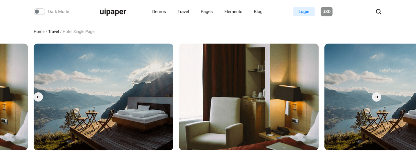
Categories slider has a structure:
<div class="single-header header-with-gallery">
<div class="wrap wrap-wide">
<div class="wrap_float relative">
<div class="wrap">
<div class="wrap_float">
<div class="header-gallery-slider lightgallery-on" id="js-header-gallery-slider">
<div class="slide">
<img src="img/hotel-1.jpg" alt="">
</div>
<div class="slide">
<img src="img/hotel-2.jpg" alt="">
</div>
<div class="slide">
<img src="img/hotel-3.jpg" alt="">
</div>
</div>
</div>
</div>
</div>
</div>
</div>
The “lightgallery-on” class you have to use if you would like turn on zoom images.
Rating
Rating code you may find in scripts.js file:
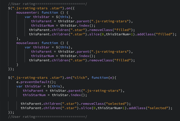
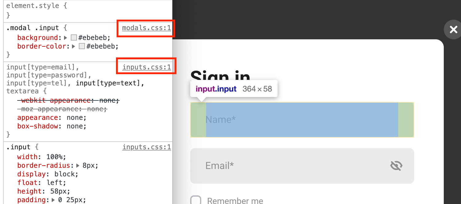
To quickly identify the file that contains the styles of the element you need, we recommend using the developer tool.
Credits
Images and video previews
All of our base photos come from the following stock
photography sites:
http://unsplash.com/
https://gifer.com
Note: Demo images are not included, instead placeholder images are used.
Video
https://www.pexels.com
https://www.youtube.com/watch?v=F5e9rZg0CjI
https://vimeo.com/281532045
Fonts
Google Fonts Roboto
https://fonts.google.com/specimen/Roboto
Scripts
jQuery http://jquery.com/
jQuery UI https://jqueryui.com/
Slick.js slider http://kenwheeler.github.io/slick/
Device.js https://github.com/matthewhudson/current-device
lightGallery.js https://sachinchoolur.github.io/lightGallery/
jQuery Mousewheel https://github.com/jquery/jquery-mousewheel
jQuery placeholder label https://github.com/fnordo/jquery.placeholder-label
Changelog
Publication date
March 9, 2021
Updates
Update 19 April, 2021 – New Travel Template. 21 new Pages & Blocks
March 9, 2021 – fixed video in sidebar
March 13, 2021 – fixed mobile menu
March 19, 2021 – Added fixing top panel when user scroll page
March 28, 2021 – Fixed bugs: 1) Fixed mobile menu, profile link 2) Fixed background video in posts 3) Fixed instagram section. To apply updates please replace js and css folder, and add class “grid” for div.instagram-posts-list (see https://uipaper.hellodigi.ru/)
Comments
Comments have nesting: comments-list > comments-list-item > comment-item.
div.comment-item is the single comment. The reply-comment is marked with the reply class. The comments-list-item block contains one comment and all the replies to it, if any.
<div class="comments-list">
    <div class="comments-list-item">
        <div class="comment-item">
            ...
        </div>
        <div class="comment-item reply">
            ...
        </div>
        <div class="comment-item reply">
            ...
        </div>
    </div>
    <div class="comments-list-item">
        <div class="comment-item">
            ...
        </div>
        <div class="comment-item reply">
            ...
        </div>
        <div class="comment-item reply">
           ...
        </div>
    </div>
</div>